AMP 30 Visual Identity System

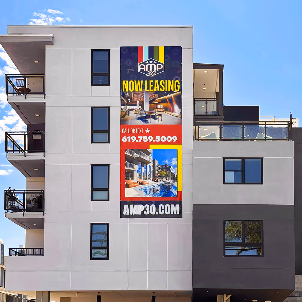
Brought in to add clarity and momentum to the H.G. Fenton Company's branding efforts, I developed the visual identity system for AMP 30, a newly developed apartment community inspired by the energy of live music.

details

Role:

Visual Identity Design and Brand Consulting

Team:

H.G. Fenton Company development and marketing teams

Deliverables:

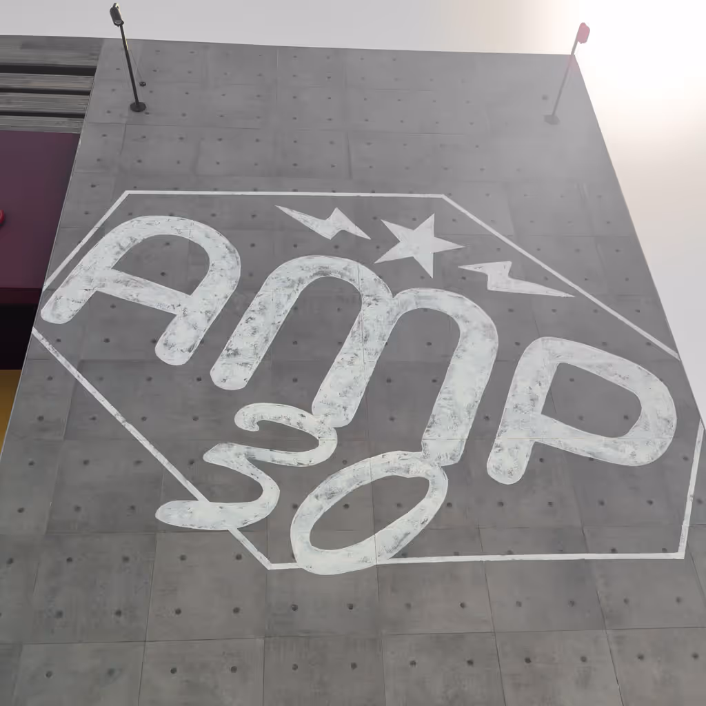
• Logo and brand mark development
• Visual identity system and color palette
• Brand standards and usage guidelines
• Application examples and design templates

Results:

Delivered a cohesive visual identity system that captured the spirit of live music, resolving year-long branding effort and enabling AMP 30's market launch.

Opportunity

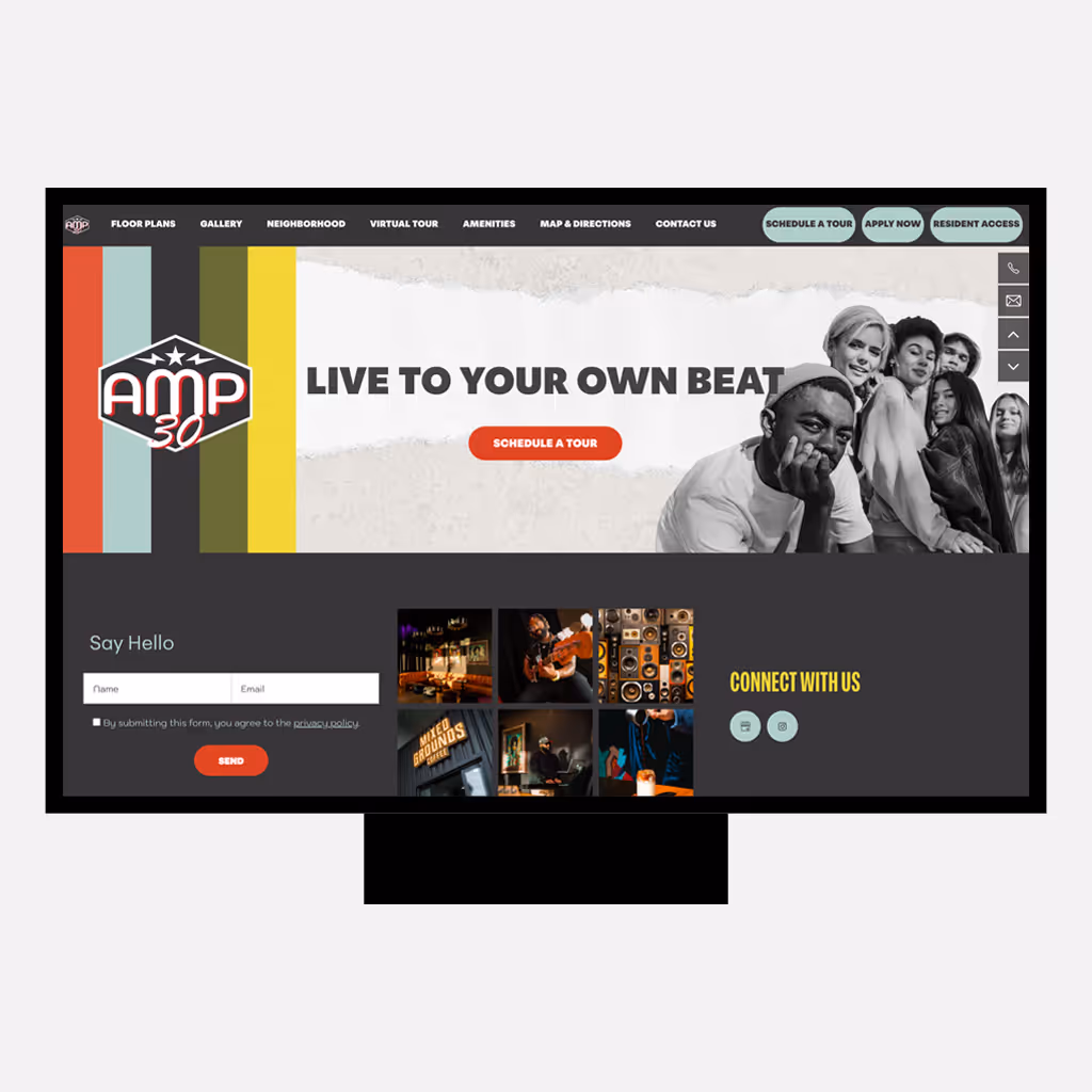
The H.G. Fenton Company required a visual identity that could authentically capture live music culture for AMP 30 after a year of unsuccessful branding attempts.

  • A visual identity was needed to resonate with young urban professionals and differentiate from conventional apartment branding in San Diego market
  • Previous branding directions failed to balance residential professionalism with authentic music energy appealing to target demographic
  • Required translating an abstract music culture concept into a cohesive visual system for leasing, signage, and environmental applications

approach

I developed multiple creative directions through rapid iteration and client collaboration to identify visual elements that resonated with the brand concept.

  • Created diverse logo mockups exploring various visual approaches to quickly test concepts and narrow creative direction with stakeholders
  • Focused on bold, high-energy symbols and music iconography through collaborative exploration and refinement process
  • Selected stars and lightning bolts as primary graphic elements, developing complete visual identity system and brand standards around these core motifs

Outcome

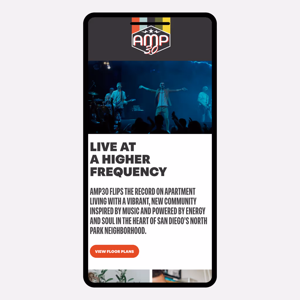
Visual identity system successfully established distinctive brand positioning and enabled AMP 30's market launch with strong music-culture connection.

  • Logo and brand system fused rock performance aesthetics with clean, modern design suitable for residential market
  • Lightning bolts and star motifs created memorable identity that resonated with target demographic and differentiated from competitors
  • Complete brand standards enabled consistent application across leasing materials, environmental design, and marketing touchpoints

Like what you see?

Let's talk. Not exactly what you had in mind? Let's talk anyway.
Thank you! Your submission has been received!
Oops! Something went wrong while submitting the form.