Acclaimed Internal Medicine Brand Development

I developed the brand identity for Acclaimed Internal Medicine, a hospitalist startup, creating a visual system that balanced modern healthcare professionalism with Arizona desert-inspired regional character.

details

Role:

Visual Identity Design and Brand Consulting

Team:

Acclaimed Internal Medicine founding team and stakeholders

Deliverables:

• Logo design and visual identity system
• Brand applications across print and digital touchpoints
• Website design and development

Results:

Created the foundational brand identity for Acclaimed Internal Medicine, supporting its launch, market positioning, and eventual acquisition approximately two years later.

Opportunity

Acclaimed Internal Medicine required a professional brand identity to establish credibility and support market entry as a new hospitalist group.

  • Startup needed a visual identity that balanced modern healthcare professionalism with distinctive regional character
  • Founders sought to incorporate Southwest-inspired cues, including Arizona desert and sunset tones, without compromising clinical credibility
  • Brand needed to build trust with hospital partners and stakeholders while supporting long-term growth and acquisition readiness

approach

I led iterative design exploration and stakeholder collaboration to develop a visual identity balancing Southwest regional character with modern healthcare professionalism.

  • Explored a range of design directions, from abstract forms to literal landscape elements, to identify an approach aligned with the founders' vision
  • Conducted collaborative design reviews to refine the visual language and balance regional character with clinical credibility
  • Finalized a mark featuring a stylized desert mountain beneath a vivid sunset, capturing regional beauty and a forward-looking healthcare ethos

Outcome

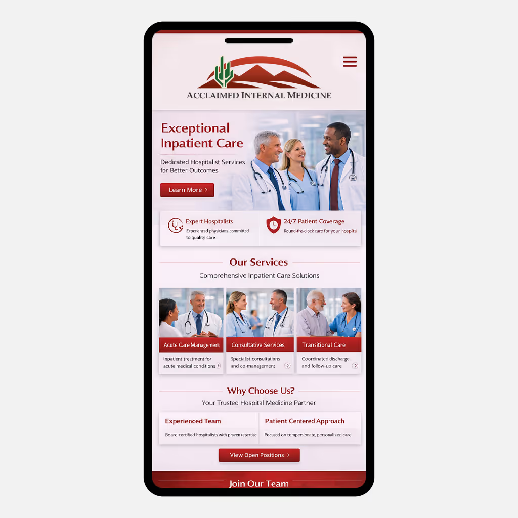
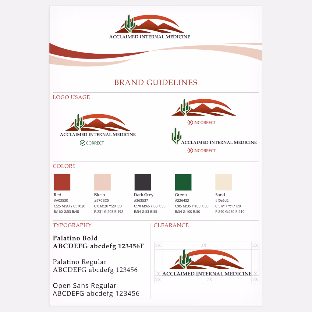
The visual identity established a professional and distinctive healthcare brand presence that balanced modern clinical credibility with desert Southwest regional character.

  • The logo blended contemporary healthcare professionalism with desert Southwest-inspired visual cues, creating memorable differentiation in competitive medical services market
  • The brand system applied consistently across digital and print touchpoints, providing cohesive visual foundation from company launch
  • The cohesive identity supported market entry and stakeholder trust, contributing to successful acquisition approximately two years after establishment

Like what you see?

Let's talk. Not exactly what you had in mind? Let's talk anyway.
Thank you! Your submission has been received!
Oops! Something went wrong while submitting the form.